Problem
Most planning tools ask for an account before you've written a single task, then bill you monthly for the privilege. I wanted the opposite: open the page, start planning, and never think about a login screen.
Who it's for
People who plan in weeks, not quarters, and want a tool they can open in a second. It started as my own planner. Then other people picked it up: a coworker who now runs real day-to-day operations through it, plus two family members and a friend. That changed the job: it now had to be dependable for people who weren't me, on devices I don't control.
Process
I started from the week grid itself, since that's the one view a planner can't get wrong. From there I layered in sections, inline editing, and a Pomodoro timer, testing each addition against the same question: does this still feel calm, or does it start to feel like a dashboard?
Key decisions
- Monochrome palette to cut visual noise so the content, not the chrome, holds attention.
- IBM Plex Mono for structural elements paired with Manrope for reading text, so the interface feels precise without feeling cold.
- All data stored locally in the browser. The tradeoff is no cross-device sync, made deliberately in exchange for privacy and zero setup friction.
What I said no to
Every request gets the same two questions: will people hit this every week, and does it keep the promise of no account and no setup? A feature has to pass both.
- Cloud sync and accounts: no, by design. They'd solve moving between devices, but they'd break the reason Deepweek exists. Validated JSON backup and import cover that need instead.
- Calendar, day and month views, and subtasks: yes, and shipped. See Growing past the week.
- Recurring tasks: next on the roadmap. It passes both questions and needs nothing beyond the browser.
- Unlimited subtask nesting: no. One level covers breaking work into steps, and deeper nesting would turn the planner into an outliner.
- Google Calendar import: held back. It's a reasonable ask, but it requires signing in to Google, which fails the second question until there's a way to do it that keeps planning account-free.
Growing past the week
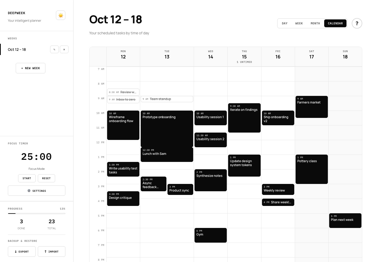
The week grid was the right place to start, but it stopped being enough once other people were running their days through it. In version 2 I renamed the product Deepweek and added Day, Month and Calendar views, plus subtasks.
The signal came from users. The people using it day to day kept asking for the same things. They wanted to see further ahead than seven days, to focus on just today without scrolling past the rest of the week, and to break a big task into steps instead of writing several loosely related tasks. When different people ask for the same thing without prompting each other, I treat it as a real need, not a preference.
Then I checked it against the category. I studied how established planners and calendar apps handle the same problems. Switching between day, week and month is standard in calendar tools, and nested steps under a task are a core pattern in mature to-do apps. People already know how these work, so adding them meant meeting existing expectations, not teaching something new. Both features also passed my two questions: people would use them every week, and they need nothing beyond the browser.
- One plan, four views. Day, Week, Month and Calendar all read the same data, so a task edited in one view is the same task in every other. To make that possible I gave every day a real date and wrote a migration that works out dates for existing plans from their day names. Nobody had to re-enter anything.
- Calendar shows time, not everything. The Calendar view lays the week out on an hourly grid, sized by each task's estimate. Tasks without a time aren't squeezed in. Each day shows a quiet "untimed" count instead, so the view stays honest about what's actually scheduled.
- Month is for orientation. Each day previews a few tasks and a done count. Clicking a day opens it, and clicking an empty date starts a new week there, so the month view also serves as a way into planning.
- Subtasks go one level deep, on purpose. Deeper nesting turns a planner into an outliner, which is a different tool. Finishing the last step finishes the task, and checking off the task finishes its steps, so progress never contradicts itself.
The rename followed the same reasoning. "Weekflow" described a tool that only showed a week. "Deepweek" keeps the weekly rhythm and names what the app is really for: focused work, backed by the built-in focus timer.
Measuring success
Deepweek collects no analytics, and that's part of the point. With a small group of known users, I measure it the direct way instead:
- Primary: people keep opening it week after week, not just in the first week.
- Feedback loop: every complaint gets either a fix or a deliberate, explained no. Nothing just sits.
- Guardrail: nobody loses a week of planning. Storing everything locally makes that the biggest risk, so imports are validated before they load and unreadable data is kept as a recovery copy instead of being overwritten.
If Deepweek grew past the people I can talk to, I'd add opt-in, anonymous counts of weekly active planners and backup exports, and nothing more.
Outcome
Shipped and in active use today. Since launch I've added drag-and-drop reordering, a dark mode toggle, and JSON/CSV export based on my own week-to-week use and my users' feedback. It also installs as an app on desktop and phone and works offline. Version 2 renamed it Deepweek and added Day, Month and Calendar views and subtasks, all requested by users.
What I'd revisit
The monochrome constraint keeps the interface quiet, but it also means status at a glance (done vs. overdue vs. in progress) leans entirely on position and strikethrough rather than color. A future pass would test a narrow, deliberate use of color for state, without breaking the calm the palette was built for.